 We’ve secured funding to power Signal-to-Revenue AI to GTM teams globally. →
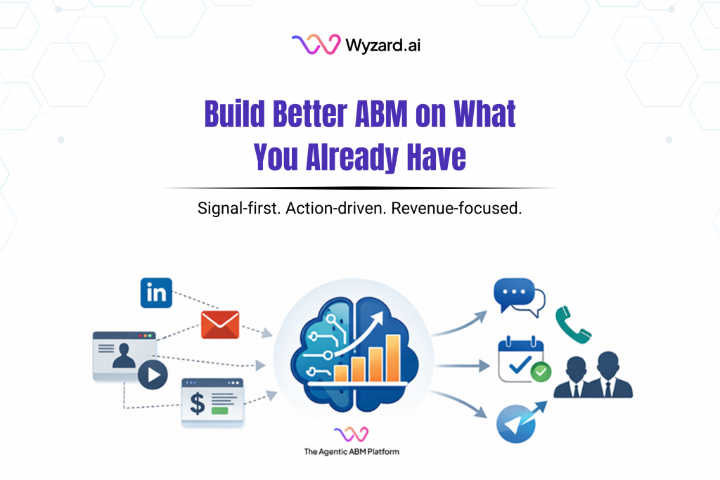
If you are a CMO, this situation feels familiar. Your team has a CRM, marketing automation, paid campaigns, webinars, ...
Subscribe Now
Outbound works best when trust stays intact. Many teams ramp up sending, then see replies drop or spam placement climb, with no clear signal on what changed. Mailbox warming is often treated like a checkbox. The risk shows up later, after a goal is live and results start to slip.
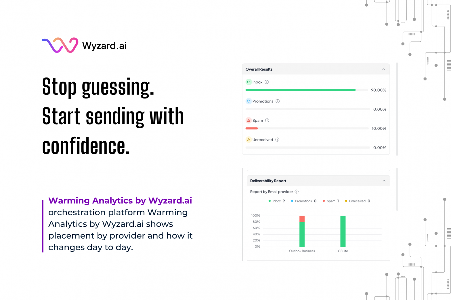
Wyzard.ai built Warming Analytics to give teams a clear view of warming health before a sender is used in WyzGoals. The goal is simple: replace assumptions with visibility.
The Gap Teams Ran Into
Before Warming Analytics, teams lacked a structured way to answer basic questions:
- Is this mailbox safe to send from today?
- Is warming improving over time, or drifting in the wrong direction?
- Do Outlook and Google behave the same for this sender?
Without those answers, scaling decisions turn into trial and error. A mailbox might look “fine” at a glance, yet spam placement could be building with one provider. By the time it becomes obvious, the goal has already lost momentum.
What Warming Analytics Shows Inside Wyzard.ai
Warming Analytics adds two visual views that make warming health easier to read.
Overall Deliverability Distribution (Provider-Level)
This view shows email placement across Inbox, Promotions, Spam, and Unreceived, split by provider (for example, Outlook Business and Google Workspace). It gives a quick diagnostic of where messages land, highlights spam placement early, and makes provider-by-provider differences hard to miss. The inbox vs spam ratio becomes visible at a glance.
Daily Warming Trend Graph
This view tracks daily Inbox count and Spam count over time. It helps teams confirm steady progress, spot sudden drops, and separate a one-day dip from a real trend. The result is a readiness signal rooted in patterns, not a static snapshot.
How It Improves Goal Execution
With these views, teams can make faster calls on sender usage:
- Use a sender in a goal now, or hold it back
- Identify which provider is underperforming
- Check if warming is trending upward, flat, or slipping
That clarity matters for lean GTM teams running multiple goals and multiple senders at once. Fewer surprises means more stable volume, cleaner deliverability, and more predictable outcomes from the traffic you already have.
Want To See It Live?
If you are scaling outbound this quarter, Warming Analytics helps you spot risk early and pick the right senders with confidence. Get a walkthrough, learn more at Wyzard.ai.
Other blogs
The latest industry news, interviews, technologies, and resources.
March 30, 2026
The Signal-to-Revenue Blueprint for Agentic ABM
A CMO reviews the weekly dashboard and sees strong activity. A target account clicked a LinkedIn ad. Another stakeholder ...
March 27, 2026
What Is Agentic ABM? A Practical Guide for Enterprise GTM Teams
Enterprise GTM has an action gap. If you are a CMO, this scene is familiar. A target account clicks ...
